
EKSTRAKT
- Role
- Renderings; form language, identity and logo
- Year
- Autumn 2025
- Tools
- Fusion 360, Blender, Illustrator
- Type
- Freelance project · Ekstrakt, Copenhagen
Renderings and visual identity for Ekstrakt, a Copenhagen company selling dietary supplements. I rendered the tin and the packaging, and helped shape the form language, identity and logo.
The process
- 01UnderstandA dietary supplement in capsules, sold in a tin and a box.The brief
- 02IdentityA plain wordmark and a symbol of rounded, linked shapes.Identity · Form and symbol
- 03LayoutWhere the wordmark, name and symbol sit on the tin and on each face of the box.Layout studies
- 04RenderThe box and the tin, modelled and rendered for the brand.The box · The tin
- 05ProduceThe tin and the box, made for real.Prototype
- 06ReflectDelivering to a real client for the first time, under time pressure.Looking back
The brief
The product is a dietary supplement in capsules, sold in a tin and a box.

Identity
The identity is a plain wordmark and a symbol built from rounded, linked shapes, used together or on their own.
The line “Pure extraction. Natural resilience.” carries the brand on posters, with black and white imagery and a lot of empty space.


Form and symbol
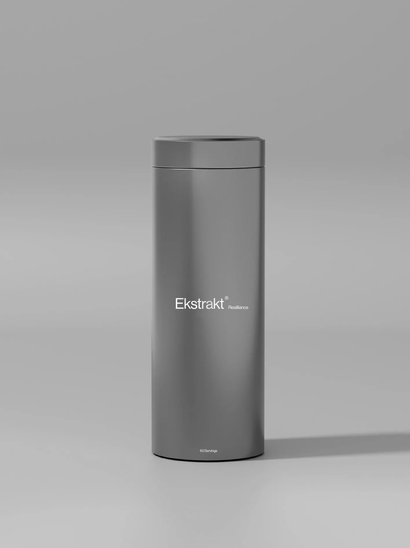
On the tin, the symbol is the only graphic element apart from the product name, so the brushed metal and the form carry the rest.
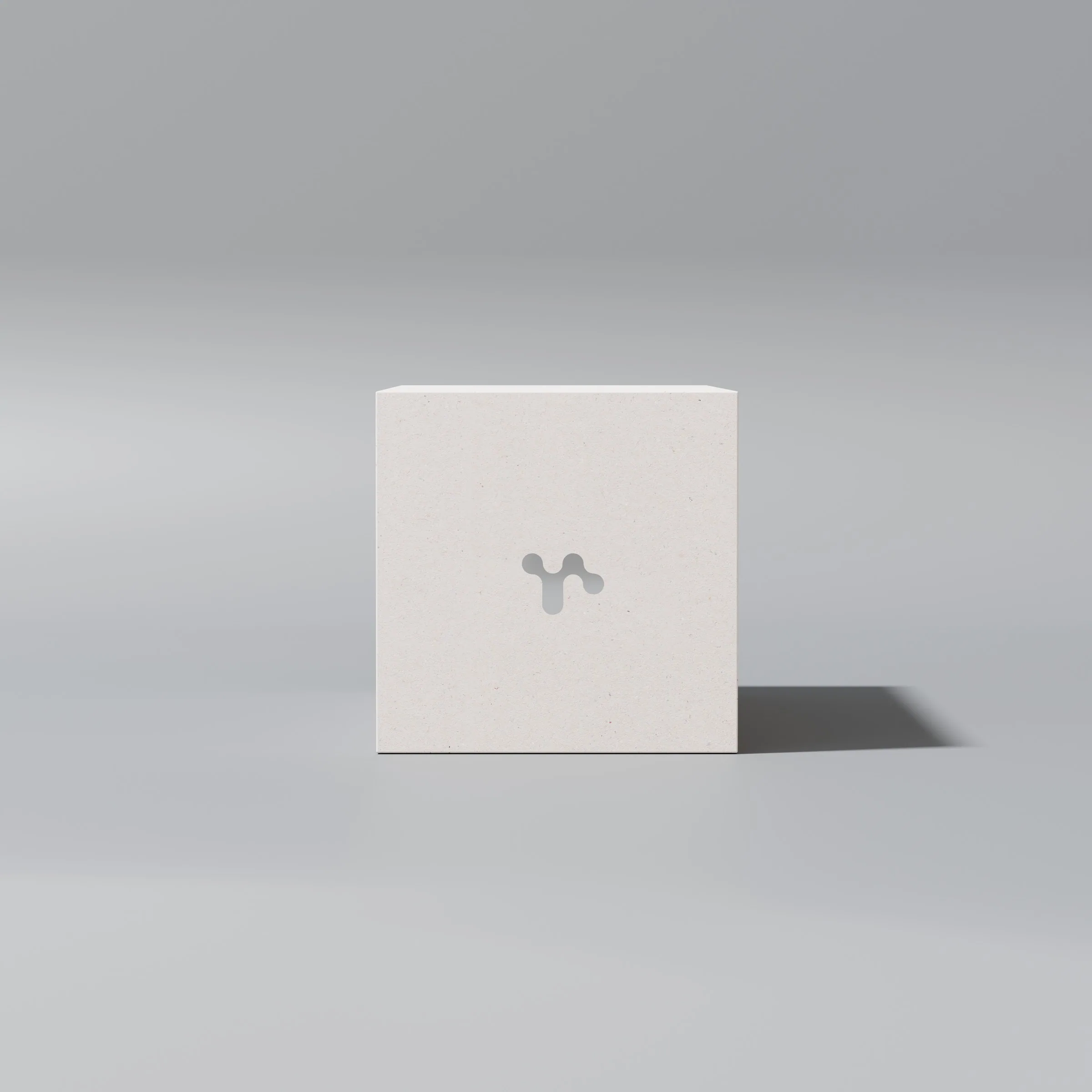
On the end of the box, the symbol was rendered cut out, in white and in black.



Layout studies
Before the final renderings, the layouts were tested on simple mock-ups: where the wordmark, product name and symbol should sit on the tin, and what goes on each face of the box.




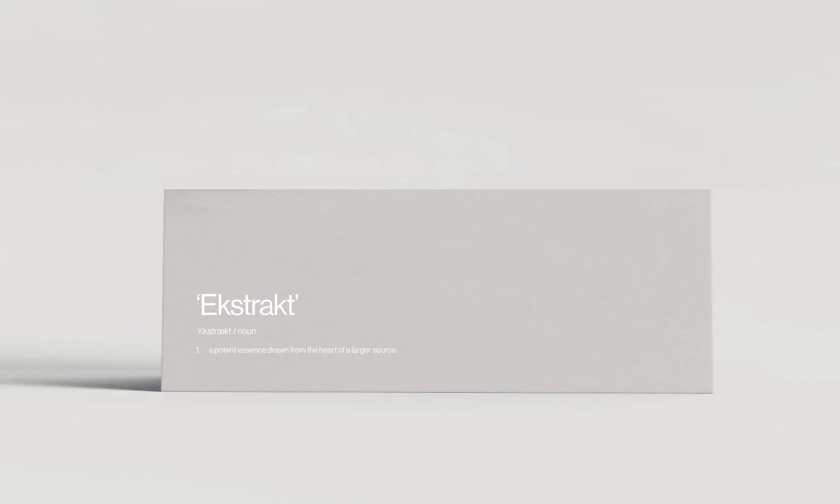
The box got the same treatment, one face at a time.



The box
I rendered the box with the wordmark in grey, white and black, both on its own and with the product name.


The tin
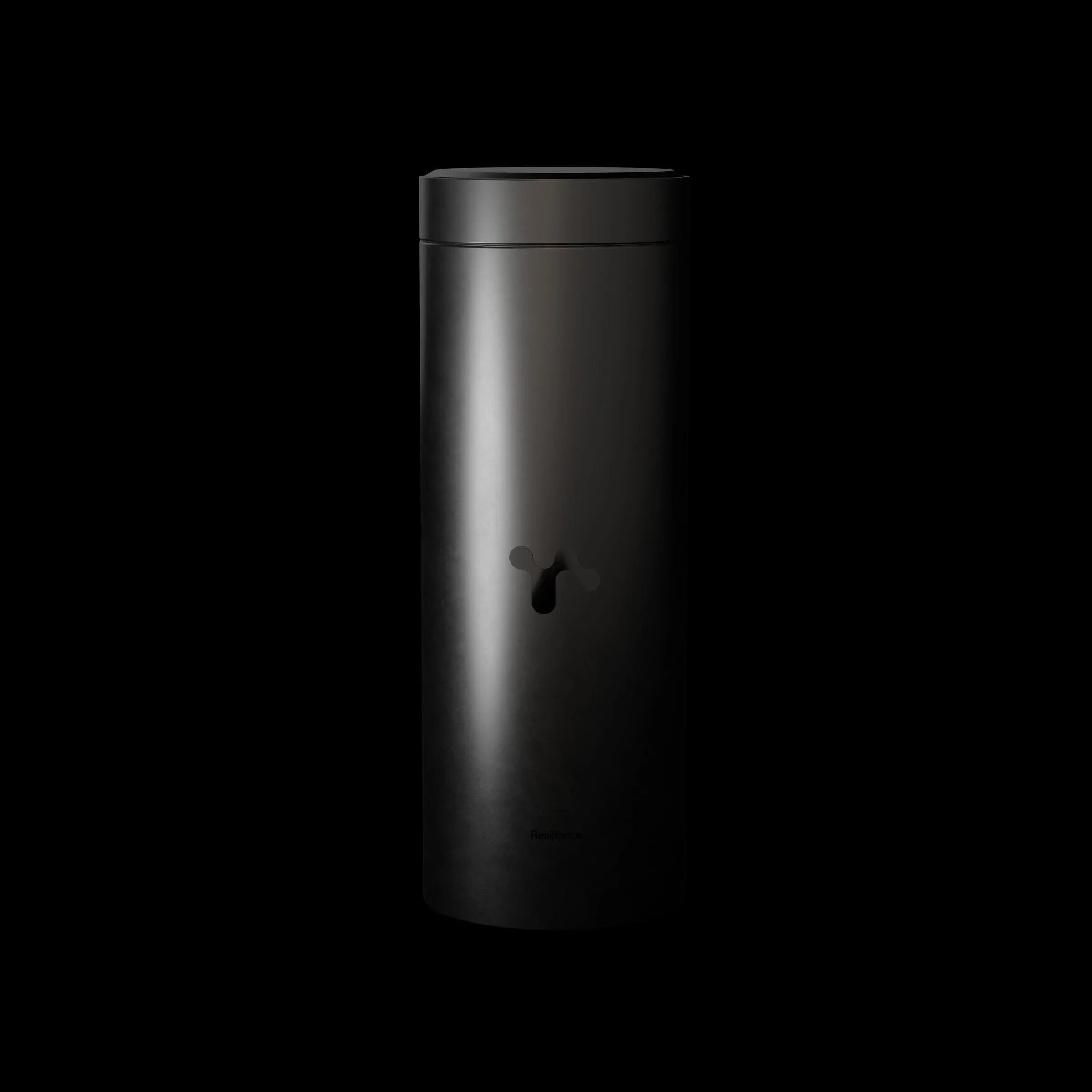
I rendered the tin against three background colours with the capsules scattered around it, and in a dark version.



Prototype
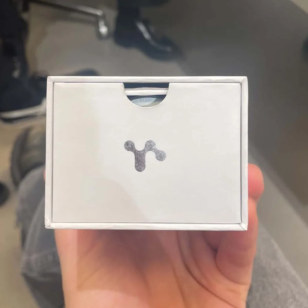
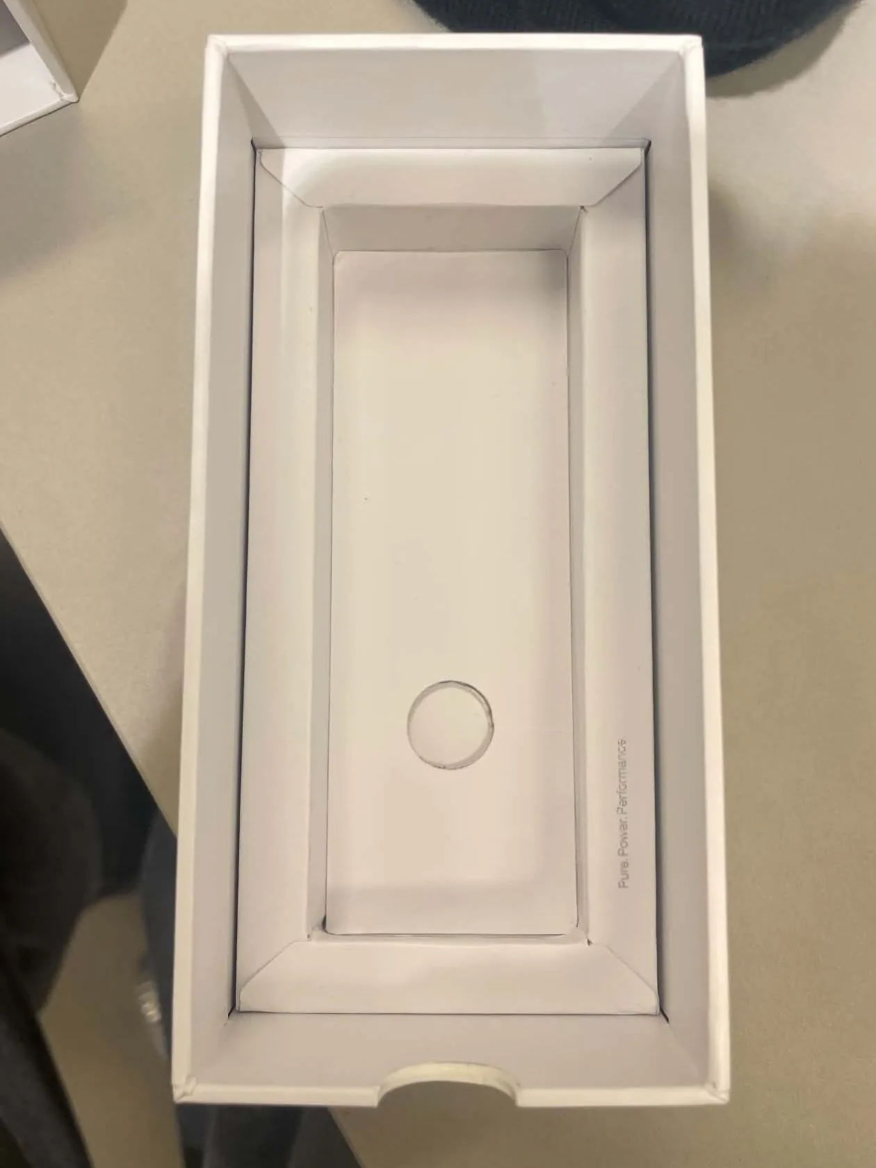
The tin and the box were also made for real.


Looking back
The hardest part was the time pressure, and the fact that this was the first time I delivered work to a real client rather than for a course. There was no room to keep exploring for the sake of it; every rendering had to be finished, consistent and ready to use.
It was a steep way to learn, and a lot of fun. Working that fast gave me new instincts: for when an image is done, for what to leave out, and for how much a plain form and a single symbol can carry on their own.